Introduction to Heat Maps in Analytics
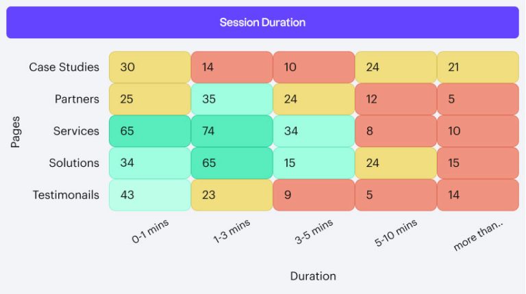
In the landscape of data analysis, heat maps have become instrumental in illuminating patterns and relationships that numbers alone cannot. Businesses across the globe now turn to a sophisticated heat map generator to visualize diverse data sets in an understandable and aesthetically pleasing manner. Not only do these visual tools aid in the quick digestion of data points, but they also facilitate richer storytelling by translating complicated statistics into vibrant color spectrums, which is beneficial for analysts who need to synthesize and present their findings to varied audiences.
Heat Maps: A Tool for Complex Data Analysis
The ability of heat maps to render multi-faceted data into a single image is a testament to their power in analytics. Heat maps create a visual hierarchy that communicates high or low values by layering data points over a color gradient. They are particularly advantageous when data spans multiple dimensions, such as time series analysis, where they can show how variables change over hours, days, or months. This versatility makes heat maps a preferred tool for analysts in finance, public health, retail, and beyond, where data is complex and insights drive success.
Enhancing User Experience with Heat Maps
In digital arenas, user experience is paramount, and heat maps have emerged as a key player in optimizing website design for intuitive navigation. Web analysts pour over these colorful charts to discern which page elements are engaging users and which are being overlooked. Whether identifying which buttons get the most clicks or understanding the scroll depth of different web pages, heat maps help remove the guesswork from user experience enhancement by revealing a website’s ‘hot’ zones that captivate a visitor’s attention.
Creating Actionable Insights Using Heat Maps
Turning a sea of numbers into actionable insights is the most profound use of heat maps. By visually aggregating data, managers can quickly identify operational excellence or concern areas, streamlining the decision-making process. In healthcare, emergency response, or even education, heat maps can be critical in revealing demand surges or gaps in service delivery, thus allowing quick actions to address pressing needs and optimize service delivery based on quantifiable evidence.
Strategic Planning with Heat Map Data
Strategic planning can gain a new level of clarity with the incorporation of heat map analytics. These maps serve as a launchpad for strategic discussions through visual data displays, enabling clear communication of complex data across organizational hierarchies. Heat maps can quickly convey areas where resources are needed most or market opportunities may expand, aiding in a data-driven approach to strategic business moves.
Understanding Environmental Trends
Heat maps can depict environmental changes with clarity that is often striking and immediate, prompting a more profound awareness and inciting action from policy-makers and the public alike. Prominent examples include visualizations of deforestation or ice melting patterns due to global warming.
Innovations in Heat Map Technology
The dynamic field of heat map technology is ever-expanding as developers continually introduce new features that enhance user interaction and data manipulation. Modern tools now allow the overlaying of heat maps onto three-dimensional surfaces or the creation of interactive charts that respond to cursor movements, making these visualizations more informative and engaging for the user.
Geospatial Data and Heat Map Analysis
Geospatial analysis has witnessed a metamorphosis with the integration of heat maps, providing a spatial dimension to data visualization. Whether for urban planning, environmental conservation, or marketing, GIS heat maps offer a topographical view of data that can be pivotal for location-based strategic decisions. Their widespread use in monitoring and planning illustrates their indispensability in disciplines where the ‘where’ is just as important as the ‘what’.
Tackling Big Data with Heat Maps
Big data sets, characterized by their volume, variety, and velocity, can overwhelm traditional analysis methods. Heat maps provide a valuable solution by synthesizing vast amounts of data into digestible visual representations. Patterns and correlations emerge easily on a heat map, aiding organizations in deriving meaningful insights, whether for improving customer service, streamlining operations, or identifying new market trends. Heat maps offer a clear path through data clutter in a world where data analytics is pivotal to competitive advantage.
The Rise of Advanced Heat Map Applications
Interactive and three-dimensional heat maps signify just the beginning of advanced applications in data visualization. These next-gen maps directly address the need for more nuanced data analysis tools that can translate to actionable real-world applications. By offering a platform to engage with the data on an interactive level, these advanced applications herald a new frontier in analytics that marries complex data with user-centered design, yielding an unprecedented depth of insight.
Conclusion: Integrating Heat Maps into Future Analytics
The future of analytics is indubitably intertwined with the evolution of heat map technology. As data grows in volume and significance, the need for tools to succinctly translate that data into actionable insights becomes more crucial. Heat maps have proven their value as essential to the analytics toolkit, providing clarity, enhancing comprehension, and fostering informed decision-making in an increasingly complex world.

